19.12.08

sarti design blog - back strong in 2009

My solid blog promise to you is that the blog will be back in 2009... check this space in nearly January for some Featured Projects I have been working on in Nov/Dec, as well as some hits from the past!

Have a very Merry Christmas and a Happy New Year.

Leigh Sarti

13.10.08

Exterior Interior Design

This wall is going up at our house right now. It's not actual brick,
but it sure looks like it. I'll post another pic after it's finished.

featured project: kids small groups


I just finished up this project last month and wanted to share a few different facets of the overall design, starting today with the curriculum notebook covers. There are eight books in total with the age o the user ranging from Pre-K to 6th Grade. The style was broken up into two sections with a younger design feel and older design feel. The younger covers were a more illustrative concept based around "local adventure" and were all created in Illustrator. The older covers were more image-driven and based around "global adventure". More to come from the KSG design project!

29.9.08

featured project: bff

The Children's Ministry at Saddleback are going through a church-wide campaign called 40 Days of Love. They retooled the kid's curriculum to be called BFF (which I love!) I had the privilege of working through the design of this series based on a cell phone screen. The challenge with this design was featuring the BFF so that it was the prominent part of the design, without just looking like a hunking huge Zac Morris cell-phone as the entire design! I think it was balanced out great by the boy and contrasted well with the brick wall and slick blue floor (of the Refinery building).

21.9.08

Some Design Inspiration

I love opening up a cold "hecho in Mexico" glass bottle of Coke before
tackling a new creative idea!

back from blogcation


I just returned from a little vacation to Australia for a family wedding... lovely trip... my kids were the cutest ever as pageboy and flowergirl... I even managed a few work days with a client in Australia touring their factory (see picture above, a prize for what the machine is making!).
I'll be posting some new projects and photos in the coming week as I get back in the swing of things!

28.8.08

featured project: simply amazing

I have been working on another multi-church event in Visalia, CA much like this event.
For this project I needed to create a poster with a totally different feel, but still utilizing the same main image of the featured entertainer Danny Ray... the differentiation came through the font choices and the vibrant red background.

24.8.08

featured project: FUEL Bulletin

I have been working on some "bulletin shells" for South Charleston First Church of the Nazarene (how's that for a long church name?!)
Working from the colors and energy of the FUEL logo (that i had designed previously) the goal of this design was something that continued the branding effort for FUEL, utilizing aspects of the current logo and expanding that with pictures, new texture and reformatted ministry information.

Need something similar for your ministry?! Let me know!


19.8.08

featured project: saddleback intern ministry ad

A few weeks ago I had blogged about a photoshoot I did for the new Saddleback Church Intern Ministry ad. Well, the photo shoot egg has now hatched and out came the advertisement below!

featured project: LOTE Ads

just finished working on these web ads for LOTE.org - Living on the Edge.
If you are looking for some great resources for small groups or personal discipleships, you should check out lote.org!


three open doors

I made a couple of web banners for Open Doors USA. They are a great organisation whose purpose is to help persecuted Christians around the world. You cn check them out at http://opendoorsusa.org/


featured project - the great illusion

I just finished this project with a group of churches up in Visalia, CA for a combined Jr High Overnighter Event. They were looking for an old French circus feel - this look is achieved through the colors, typeface and matte feel.

1.8.08

featured project: cmi

I am just finishing up a branding project for Cornerstone Media International (CMI) and wanted to share this project with you.
The goal with this design was to focus on an iconic base for CMI that was built into the logo, but wasn't simply the acronym... the play button and radio waves deliver a simple picture of exactly what the purpose of CMI is, which is to deliver your message to the world.


30.7.08

photoshoot for new ad

This week I am working on some new advertising for the Intern Ministry at Saddleback... here are some shots from the shoot... can't tell you what the end product will be yet, but I'll be sure to blog about it when it is done.
My part-time model is Josh Pease (in case you are wondering)


29.7.08

from the picture archive: paris street lights

Here are a couple of photos I just stumbled across from a trip back in 2006 - I loved this set of street lights, and the sun was just breaking through the clouds, which made for a brilliant backdrop. It was taken in Place Vendome, not too far north of the Louvre.


24.7.08

bbq design

I couldn't help but take some shots of these two different times I have bbq'd in the past few weeks... the asparagus is a beautiful design. Thanks God!


In case you are curios - one set of shots is Pork Chops, and the other is Lamb Chops. I like lamb chops.

18.7.08

{look} out

17.7.08

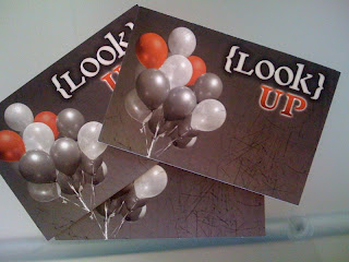
{look} up

{look} near and far

16.7.08

{look} within

{look} around

{look} different

15.7.08

{look} for

{look} project

I had the privilege this year again of designing the look (for lack of a better turn) for the PDYM Student Leadership Conference. The theme this year is LOOK so we created an overarching {look} brand and then seven feature images for each general session that has a LOOK theme to it... as the sessions roll out over the week I will post the feature image for each.
What we did with each feature image is print up a postcard for each, enough for all the students attending.. then at the end of the session they have a chance to respond to the message by writing a postcard to themselves. As they leave the session we have a mailbox they can put them in and over the coming months we will mail the postcards as a reminder of the lessons they learned and a reminder of their conference experience!

11.7.08

where am i at 8am on Friday, July 11th

To those familiar with the world of Mac you think that I would be at an Apple store in a lovely line waiting to pick up my new iPhone 3G.
Well, the truth is at 7:15am I drove down to the local AT&T store thinking maybe there were a few Apple geeks in line, surely all the hardcore ones lined up for the first iPhone and wouldn't be so excited about this new release.
Apparently I was wrong.
There was a line of nearly 100 people at the tiny At&T store on El Toro Rd... not lined up at a sexy Apple store, but in sleeping bags outside the form of the Petco which is where the line snakes around to as it builds.
Needless to say I am at Corner Bakery, about 500 yards away, enjoying free wireless, a couch, a coffee and a cinnamon roll.
The truth is I love convenience more than a new gadget. I don't know if this is a good character trait or not, only time will tell.
I figure, hey I've waited this long, I can wait another day or two. I'll keep you posted. Back to my cinnamon roll before it gets cold.

9.7.08

a free book: The Alchemist

Just discovered this morning that on iTunes they are giving away the AudioBook "The Alchemist" as a Free Download.
I love this book, it's simplicity and storyline based on "where your heart is your treasure is also".
Go to iTunes, download the AudioBook and enjoy a great story.

3.7.08

feature project: Bella's Recycling Wall

This was a fun design.. highlighting my daughter's desire to recycle and tell a story about it... piece of cake!
We did a custom shoot with a whole bunch of bottles she had collected and the rest is design history.
Bella loves to go to the Refinery and see her wall nowadays... let me know and she can organize a personal tour for you!

26.6.08

feature project: Grow Wall


The idea for this wall was a graphic representation for Discipleship. The plasma TV was going to be a fixture, so the design had to be weaved in and around the TV. The idea was to integrate the TV into the trunk of a tree and then have the growth branches coming out of the sides and top of the TV.
For the actual application on the wall I had a painter come in and paint the tree and background on the wall, then the words were designed as a decal that was applied... the final touch was a frame I made from an old fence that had it's color blend with the trunk. Playing on the TV is a whole range of looping growth and discipleship images (it is a TV/DVD combo).
Add a nice red chair and a coffee table and presto, a wall design!

23.6.08

feature project: Shape For Ministry Wall

This was a "last-minute" project that covered a wall area and wrapped around an elevator!
The goal for this wall was to tell the story of a high-school girl who had found her niche in serving, then encourage others to follow her lead.
I used a little texture on the wall to set it apart, but kept with the main colors of the building with the texture color. I didn't want to waste the space above the elevator, but it was too high for the body text , so I just "bit into" that area a little to utilize the space.
Megan (the story subject) was kind enough to meet us in person at the Refinery and ironically enough I actually took her picture in the exact same spot that she was life-size on the design!
Thanks Megan for your story, I hope it touches others and encourages them to find their shape for serving others.


21.6.08

feature project: Hoops of Hope Wall

The Refinery Student Ministry Building has now officially opened at Saddleback Church and I had the privilege of designing a number of different "feature walls" in the building... I am going to blog about these in the coming week.
The first wall I wanted to feature is the "Hoops of Hope Wall".
The goal for this wall was to tell the basic story of Hoops of Hope, make it eye-catching, and also educate people about how you can get involved.
-We told the story using two mediums, the text on the wall, and through a 12 minute CBS feature on Hoops of Hope looped on the DVD player.
-We made it eye-catching using a few 3D elements such as a fully size mounted basketball hoop, spacers on the info poster and the DVD player.
-We made it educational and current by creating a 24x36 interchangeable poster that highlights the current years' events. This way the information can stay relevant as well as flexible.


9.6.08

officially geeky (i think)

I am keeping up with a Gizmodo LiveBlog of the WWDC to hear the announcement of the new iPhone. Does this make me more geeky or more like an anxious new iPhone purchaser?! (or both)

4.6.08

featured project: summer spectacular

This is a project I am still putting different finishing touches on - the direction was a "kid-friendly" art direction, with movement and excitement... this is just part of a big picture design including shirts, name-badges, posters and set-design.